Stylists’ colour loves to inspire your next project
08 Jul 2025
We’ve asked some of our stylists we work with to pick their favourite colours and tell us why they work so well in design. These stylists are working with colour all the time, and we’re always inspired to see how they use colours in new and interesting ways.
Meet five of our stylists and their favourite colours.
Amber Armitage
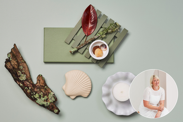
“Green is my new neutral! Nature has been my tonic lately and I’m drawn towards colour palettes it inspires. Whether it is the pale calm of Resene Eau De Nil, the earthy mid-tone of Resene Paddock or the deep back-country green of Resene Off The Grid, all these colours offer their own style of calming backdrop.
In colour theory, green has many of the same calming attributes as blue, but it also incorporates some of the energy of yellow – which makes it a winner in my books. The other thing I love is how versatile green is. It pairs beautifully with both warm and cool neutrals. I love the sandy beige of Resene Tua Tua, the bright white of Resene Alabaster and can even lean towards the grey of Resene Ted.”
Vanessa Nouwens
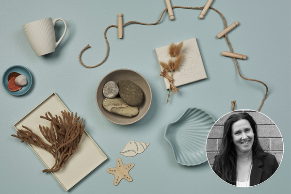
“My happy place is at the beach with the waves lapping and the sand beneath my toes, relaxing with family and friends. It makes sense then that I’m drawn to colours of the water and sandy neutrals. When it comes to tones of the water, I love pastel and greyed blues like Resene Casper, Resene Dusted Blue and Resene Lynchpin.
Resene Triple Blanc and Resene Blanc are easy-to-live-with neutrals and are tones that I associate with the soft light-coloured sand of Omaha Beach, while sandy brown hues like Resene Sisal and Resene Stonewashed remind me of walking the shoreline and collecting shells. In a coastal home I’d embrace soft, washed wood floors and furniture in Resene Colorwood Whitewash and Resene Colorwood Breathe Easy.”
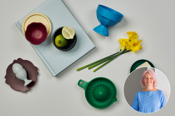
Kate Alexander
“This year, I've been experimenting with schemes that make me feel like I'm on holiday. I’m taking colours that originate in nature: blue, green, ochre, and turning up the volume on their intensity to get something more bright, fun and refreshing.
I always start with a white base – my current favourite is Resene Barely There as the underlying grey provides a softness. Next, there is always a blue. I like Resene Havelock North, which is great for features and details, paired with grey-based blues like Resene Duck Egg Blue or Resene Half Halcyon, great for walls. There is always a pop of yellow and my current go-tos are Resene Salomie and Resene Weathered Yellow. Resene Deep Teal and Resene Green Pea are my green faves, great for a striped feature wall or accent area. Add a smidge of deep, dusky red like Resene Pandemonium or Resene Incarnadine and always have a black like Resene Black Sand on hand for details like edges, doorways and handles.”
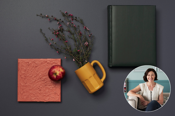
Katrina Hobbs
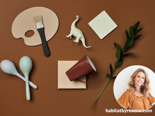
“To me, colour is intricately tied to emotion and using it to amplify or complement emotions is a passion of mine. What better canvas to explore colours than within our own homes? I’m currently gravitating towards the embrace of warmer hues that infuse a sense of cosiness into a room; shades like Resene Gun Powder, with its rich depth and warmth softened by hints of lavender, and Resene Black Bean, a deep, green-enhanced black. To contrast and add a touch of levity I love the terracotta tones of Resene Apple Blossom and the lively energy of Resene Hot Toddy. Both are rich enough to pack a colour punch while still being soft in their delivery. Incorporating these four shades into a space will create an atmosphere that is both tranquil and invigorating.”
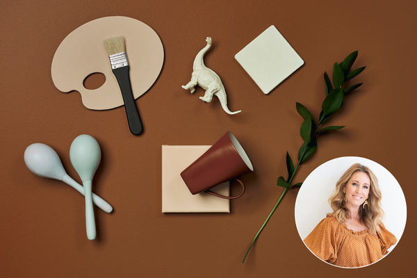
Melle Van Sambeek
“I am always drawn to warm hues. They just make me feel good, and that is exactly what colour should do. In your home, surrounding yourself with mood-enhancing shades will just make you feel awesome. The colour that currently does that for me is the warm copper of Resene Cinnamon; good for a cocoon-like bedroom or even used in a dining area with dark floorboards to create an enveloping space. Resene Mocha is another warm oxide red, that will work well with dark greens and mustard shades for a warm, rich feeling.
The sunny apricot of Resene Wax Flower would be delightful in a child’s room teamed with a blue like Resene Cruise or Resene Pattens Blue, or a yellow like Resene Cornfield. Resene Cashmere is a beautiful dusty coral pink, perfect for a guest power room. Team it with glossy trim areas in dark Resene Element.”
We hope these wonderful stylists have given you some inspiration for your next projects. Stay tuned to meet another five stylists next month and hear all about their favourite colours and how they work in different spaces!
For more advice on colour head to your local Resene ColorShop, Ask a Resene Colour Expert online for free or book a colour consultation.
Published: 08 Jul 2025


