look book
latest
habitat tv

Say goodbye to the morning scramble for keys, coats and sunglasses and hello to this… see this and more videos
blog
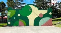
Reader roundup: Public murals and powder blues
A Morningside mural, an exterior refresh, and striped walls. Let these projects be your inspiration… more
Panelled wall and shelf in Resene Eau De Nil, upper wall in Meringue, floor in Resene Colorwood Bask. Sofa from Slow Store, lamp and table from Matisse, rug from Baya. Design by Amber Armitage, image by Wendy Fenwick.

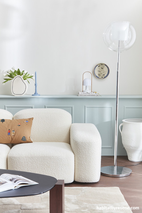
Panelled wall and shelf in Resene Eau De Nil, upper wall in Meringue, floor in Resene Colorwood Bask. Sofa from Slow Store, lamp and table from Matisse, rug from Baya. Design by Amber Armitage, image by Wendy Fenwick.

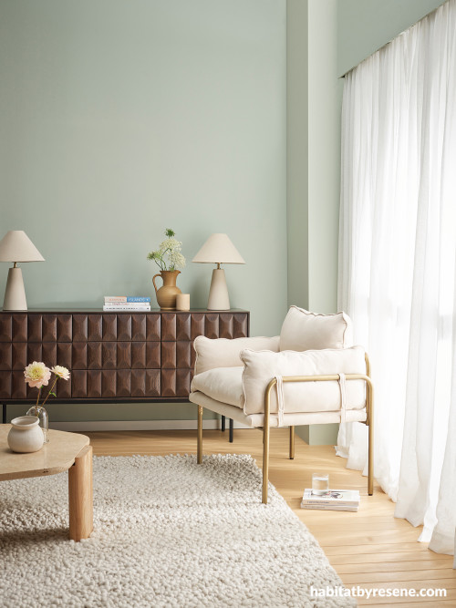
Walls in Resene Pumice, floor in Resene Colorwood Bask. Console from Danske Møbler, chair from Mocka, rug from Baya, accessories from A&C Homestore. Design by Amber Armitage, image by Wendy Fenwick.

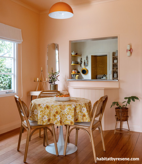
Walls painted in Resene Romantic. Design by Ingrid Russell Design, image by Florence Charvin Photography.

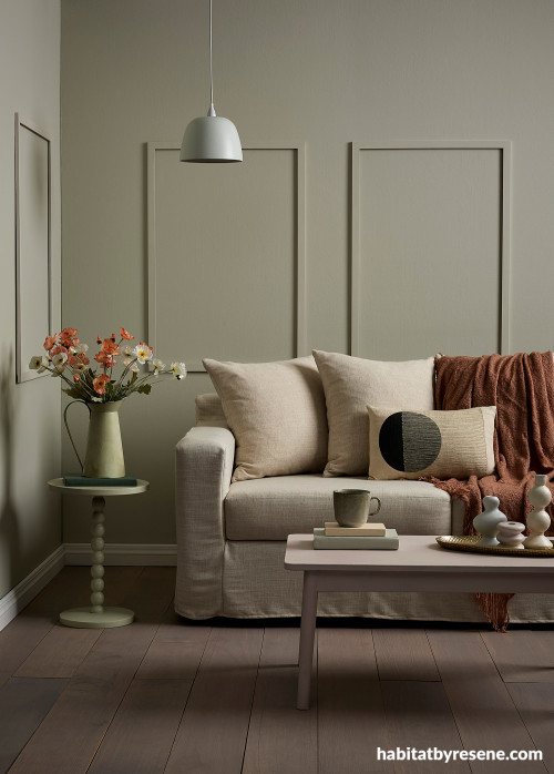
Walls in Resene Kangaroo, floor in Resene Colorwood Bleached Riverstone. Sofa from Danske Møbler, throw from Foxtrot Home. Design by Annick Larkin, image by Bryce Carleton.

Four colours we’re loving right now
The first signs of spring have arrived. As colour and new life bloom all around us, it’s a great time to get inspired and refresh our home interiors with new hues.
Spring and early summer are also the perfect time to paint as it’s not too hot or too cold, meaning you’re sure to get a great finish.
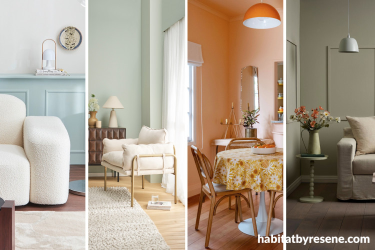
Here’s four colours we’re absolutely loving right now that reflect the transition into a new season – and into your new season of colour.
Eau De Nil
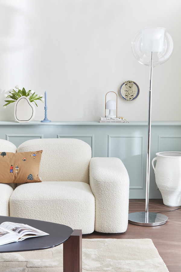
Panelled wall and shelf in Resene Eau De Nil, upper wall in Meringue, floor in Resene Colorwood Bask. Sofa from Slow Store, lamp and table from Matisse, rug from Baya. Design by Amber Armitage, image by Wendy Fenwick.
What it looks like: Resene Eau De Nil is a pale green with a tranquil soul. It's a reinvention of the popular hue in the mid 1800s - water of the Nile.
Where to use it: This gentle hue looks wonderful in living rooms, bedrooms, bathrooms, and even on kitchen cabinetry. It suits both modern and coastal homes, as well as character and rural homes.
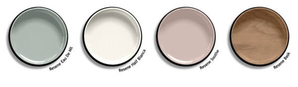
Best friend colours: For a gorgeous home palette, pair Eau De Nil with warm whites like Half Bianca on ceilings and trims, near-neutral pinks like Soothe on accent features and cabinetry, and stains like Colorwood Bask on flooring and furniture.
Pumice
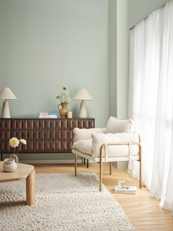
Walls in Resene Pumice, floor in Resene Colorwood Bask. Console from Danske Møbler, chair from Mocka, rug from Baya, accessories from A&C Homestore. Design by Amber Armitage, image by Wendy Fenwick.
What it looks like:Resene Pumice is a light green stone hue, quiet-natured and refined.
Where to use it: Use this hue for creating a spa-like feel in bathrooms, restful sleep spaces, living rooms, and fresh, welcoming kitchen cabinetry.
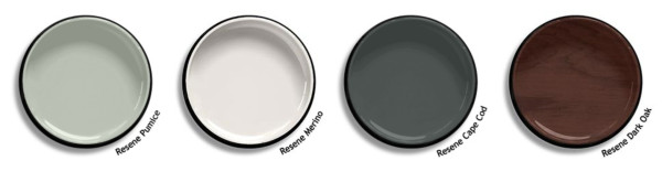
Best friend colours: Pair Pumice with accents and highlights of Merino, Cape Cod and Colorwood Dark Oak for a relaxed yet sophisticated feel.
Romantic
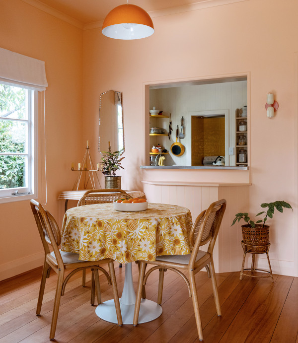
Walls painted in Resene Romantic. Design by Ingrid Russell Design, image by Florence Charvin Photography.
What it looks like:Resene Romantic is a soft peachlike apricot, like frangipani blossom.
Where to use it: This hue is perfect for spaces that feel cold or with less natural light. It brings a warm and homely feel to any space, especially dining rooms and bedrooms.
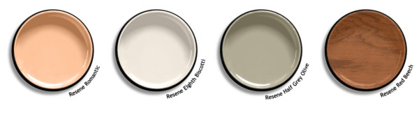
Best friend colours: Consider pairing Romantic with pinky-beige whites like Eighth Biscotti and warm, gentle greens like Half Grey Olive, with flooring and furniture in toasty stains like Colorwood Red Beech.
Kangaroo
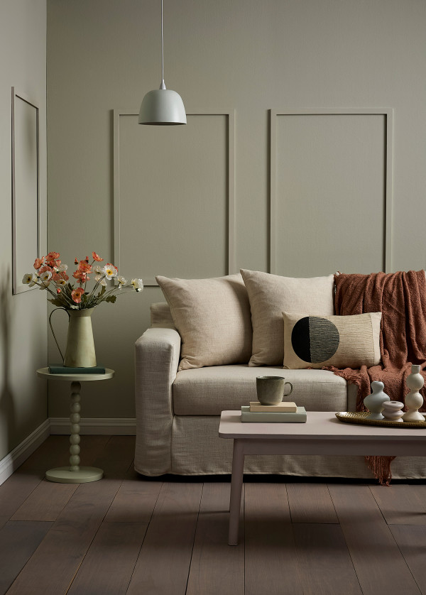
Walls in Resene Kangaroo, floor in Resene Colorwood Bleached Riverstone. Sofa from Danske Møbler, throw from Foxtrot Home. Design by Annick Larkin, image by Bryce Carleton.
What it looks like:Resene Kangaroo is a versatile grey green neutral.
Where to use it: Being a near-neutral, this hue can be used throughout any spaces in your home, from living rooms to kitchens and bedrooms. It also creates a cosy space when used in a colour-drenching method on walls, trims and ceilings.
Best friend colours: Pair Kangaroo with other earthy and muted tones like Half Titania, Lichen and Resene Woodsman Bleached Riverstone.
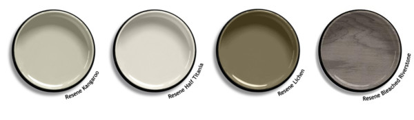
To test out colours that have caught your eye, visit your nearest Resene ColorShop to view them in person and pick up some testpots to try out at home. Colours can look different depending on what space they are in and at different times of the day. For more advice, Ask a Colour Expert online for help.
Published: 02 Sep 2026
Do you have a home full of wonderful Resene paint and colour? Send us some snaps by emailing editor@habitatbyresene.co.nz.


Resene Half Grey Olive
the look
If you're stuck on what
colour to use or need colour
advice, try out the Resene
Ask a Colour Expert service.
Resene Half Grey Olive
the look
If you're stuck on what
colour to use or need colour
advice, try out the Resene
Ask a Colour Expert service.