look book
latest
habitat tv

Say goodbye to the morning scramble for keys, coats and sunglasses and hello to this… see this and more videos
blog
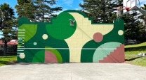
Reader roundup: Public murals and powder blues
A Morningside mural, an exterior refresh, and striped walls. Let these projects be your inspiration… more
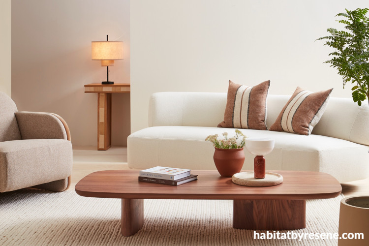

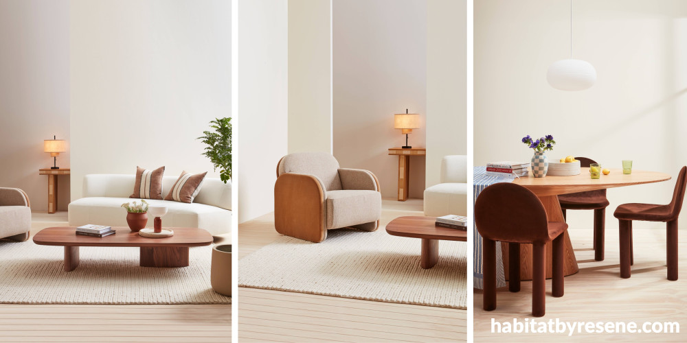
Walls painted in Resene Meringue, back wall in Alabaster, floor in Breathe Easy. Sofa, coffee table, dining table and occasional chair from Soren Liv, lamp and dining chairs from Slow Store. Design by Amber Armitage, images by Wendy Fenwick.

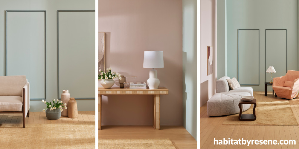
Walls painted in Eau De Nil and Contented, floor in Colorwood Bask. White chair from Woodwrights, console and sofa from Soren Liv, tables and swivel armchair from Ligne Roset. Design by Amber Armitage, images by Wendy Fenwick.

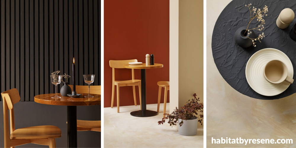
Walls painted in Resene Baltic Sea, Hairy Heath and Pearl Lusta, floor in Half Pearl Lusta. Design by Amber Armitage, images by Wendy Fenwick.

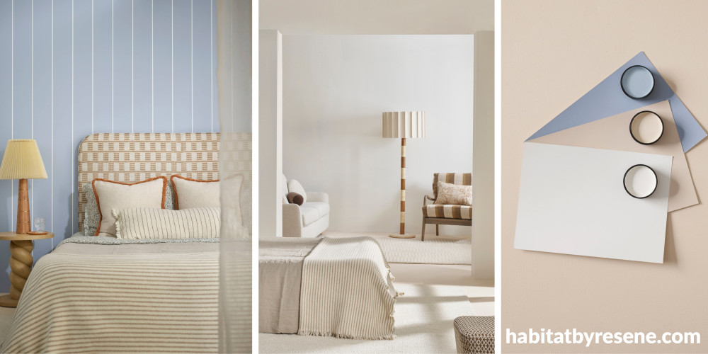
Walls in Quarter Bianca, bedroom wall in Smokescreen, floor in Half Sour Dough. Bedhead from The Ivy House, bedding from Foxtrot Home, cushions from Baya, lamps from Soho Home, chair from James Dunlop Textiles. Design by Amber Armitage, images by Melanie Jenkins.

How to choose a colour scheme for your home
We get it, you’ve sifted through countless inspiration pictures and still aren’t sure which colour you love. It can be hard knowing where to start, but we’re here to help.
The right colour scheme can not only transform the feel of your home, but also create a space you love and feel comfortable in.
Where to start
"Start with what you love,” says stylist and colour consultant Megan Harrison-Turner. “Take inspiration from the art you own, your furniture, fabrics or your travels, then balance that with the practicalities of the space.
"I strongly believe that when a home functions well for the people living in it, whether that's having enough storage, being all on one level, or having a strong connection to the outdoors, people simply do better. They feel more supported at home and recover more quickly when life feels challenging.
“Work with the space you have, that’s the practicality part. For example, as much as one can love a bright pink such as Resene Lip Service or Glamour Puss, it’s probably not be the best choice for a small family living room with limited light. Instead use it in a hallway or just on one wall in a bedroom.”
Understanding the colour wheel

Complementary colours sit opposite each other on the colour wheel. For example: Blue and orange. Although, as Megan suggests, if that’s looking a little basic in today’s colour world, give it a nudge so it’s a bit more visually appealing with teal and orange.
“I suggest varying the proportions of colour – let one colour dominate so one is supporting the lead rather than both vying for attention.”
Think of the colour wheel as a guide to creating colour combinations that feel harmonious. It helps take the guesswork out of pairing colours.
Colour scheme basics
Complementary:
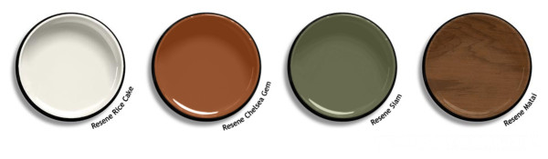
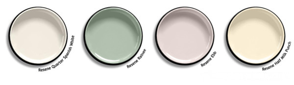
There are many shades that work well together. A mid-century scheme is a great example; colours like Resene Rice Cake, Chelsea Gem, Siam and Resene Colorwood Matai are all warm and earthy. On another hand, gentle pastels like Quarter Spanish White, Rainee, Ebb and Half Milk Punch all share a heavy base of white and their low saturation offer a calm and serene atmosphere:
Contrasting:
When choosing a colour scheme based on contrasting colours, keep your palette small. Choose a base colour, such as Resene Black White, and inject two brighter tones, such as Big Stone and Ecstasy, or Kaitoke Green and Pirate Gold, throughout our home such as on feature walls, artwork and accessories to keep things looking harmonious and not random:
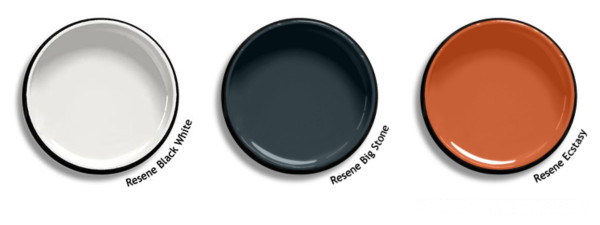
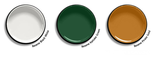
"The easiest way to use contrasting colours is to vary their proportions,” Megan says. “I often recommend the 60:30:10 rule. On an exterior, for example, the weatherboards might be the 60%, the roof the 30%, and the window surrounds the 10% accent colour."
Monochrome:
A monochromatic colour scheme uses different tones and strengths of the same colour to create a calm, cohesive look. While it's often associated with black, white and grey, it can be built around almost any hue. Try layering greens like Resene Quarter Lemon Grass, Lemon Grass and Triple Lemon Grass, or experiment with different blues from the same colour family:
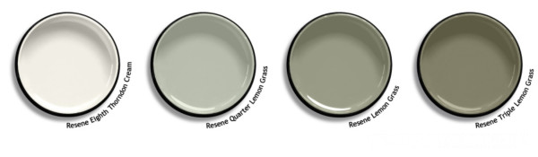
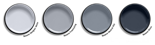
"Rather than using every strength of a colour in a row, I suggest using one, skip one, then use the next,” says Megan. “It creates a little more contrast, as colours sitting side by side (such as eighth, quarter, half then full) can often read as the same.
"To stop a monochromatic scheme from feeling flat, vary your textures, gloss levels and lighting. These subtle changes create depth and help the colours come to life.
"For a more sophisticated finish, add a very dark version of the same colour, keeping the undertones consistent, or pair it with a complementary off white. For example: Pair Lemon Grass with Karaka, or Eighth Thorndon Cream. Monochromatic schemes also make a beautiful backdrop for artwork."
Bringing your scheme together
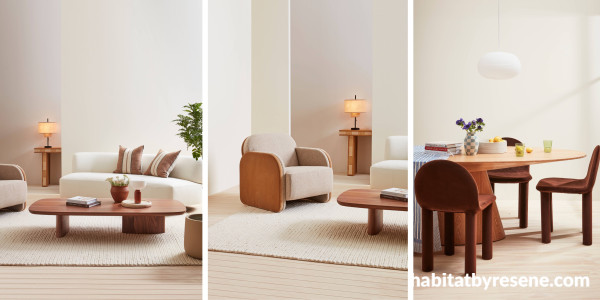
Walls painted in Resene Meringue, back wall in Alabaster, floor in Breathe Easy. Sofa, coffee table, dining table and occasional chair from Soren Liv, lamp and dining chairs from Slow Store. Design by Amber Armitage, images by Wendy Fenwick.
In this monochromatic scheme, layered whites like Meringue and Alabaster offer depth and dimension. The added contrast of timber and textured furniture break through the monochrome, complement the white palette, and ground the space.
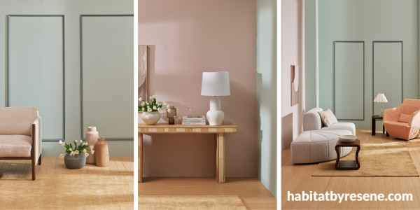
Walls painted in Eau De Nil and Contented, floor in Colorwood Bask. White chair from Woodwrights, console and sofa from Soren Liv, tables and swivel armchair from Ligne Roset. Design by Amber Armitage, images by Wendy Fenwick.
Greens and peachy-pinks are a match made in colour heaven. Whether used in their more saturated, darker forms, or lighter pastel tones like the above scheme of Eau De Nil and Contented, you can’t go wrong with this combo. Warm timber tones add to this soothing palette.
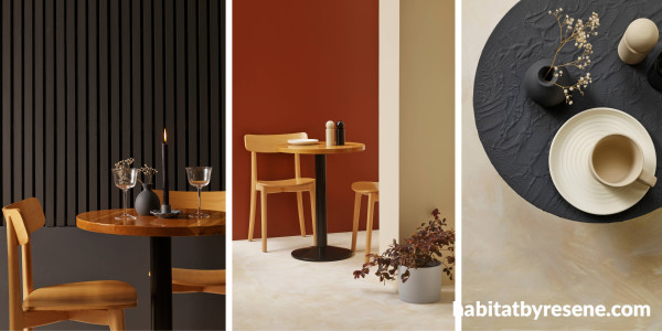
Walls painted in Resene Baltic Sea, Hairy Heath and Pearl Lusta, floor in Half Pearl Lusta. Design by Amber Armitage, images by Wendy Fenwick.
A great example of contrasting colours. The base of warm Pearl Lusta on the walls and floor pairs beautifully with the rich red-brown of Hairy Heath, while the dark shade of Baltic Sea adds a touch of sophistication and refinement.
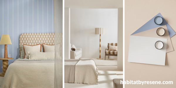
Walls in Quarter Bianca, bedroom wall in Smokescreen, floor in Half Sour Dough. Bedhead from The Ivy House, bedding from Foxtrot Home, cushions from Baya, lamps from Soho Home, chair from James Dunlop Textiles. Design by Amber Armitage, images by Melanie Jenkins.
Off-whites and gentle blues are best friends – just take a look at the beach on a summer’s day. This simple scheme of Quarter Bianca, Half Sour Dough and Smokescreen create a calm and serene home that’s both warm and cool, perfect for all seasons.
Now’s the time to test out those colours for your new interior scheme. From 23rd July – 19th August there’s 50% off Resene testpots and 20% off interior paints 4L-10L. Head to your local Resene ColorShop or shop online.
Published: 23 Jul 2026
Do you have a home full of wonderful Resene paint and colour? Send us some snaps by emailing editor@habitatbyresene.co.nz.


Resene Quarter Spanish White
Resene Half Milk Punch
Resene Kaitoke Green
Resene Quarter Lemon Grass
Resene Triple Lemon Grass
Resene Eighth Thorndon Cream
Resene Half Pearl Lusta
Resene Quarter Bianca
Resene Half Sour Dough
the look
If you're stuck on what
colour to use or need colour
advice, try out the Resene
Ask a Colour Expert service.
Resene Quarter Spanish White
Resene Half Milk Punch
Resene Kaitoke Green
Resene Quarter Lemon Grass
Resene Triple Lemon Grass
Resene Eighth Thorndon Cream
Resene Half Pearl Lusta
Resene Quarter Bianca
Resene Half Sour Dough
the look
If you're stuck on what
colour to use or need colour
advice, try out the Resene
Ask a Colour Expert service.