
latest
habitat tv

Say goodbye to the morning scramble for keys, coats and sunglasses and hello to this… see this and more videos
blog

Reader roundup: Home projects to admire!
From sunny outdoor spaces to bold hues indoors, these habitat readers are showing us how… more


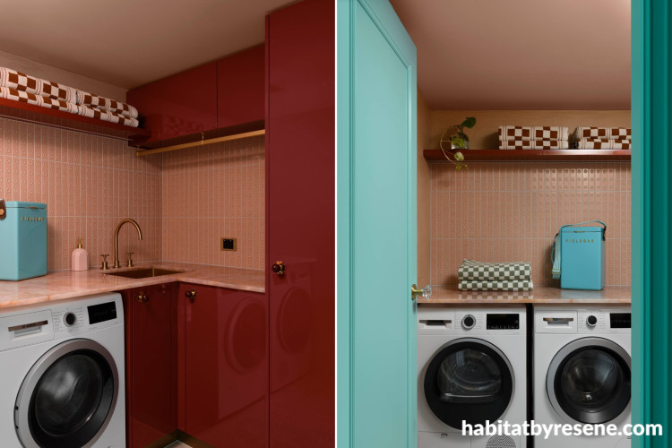
The laundry cabinetry is painted in Resene Enamacryl gloss in Fahrenheit, ceiling in Just Right and door in Aqua.


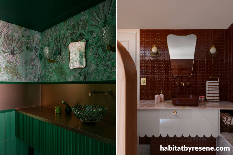
Left: Bathroom ceiling and vanity in Resene Green Pea, pairing beautifully with the green patterned tiles and bronze. Right: Vanity doors and ceiling in Just Right.

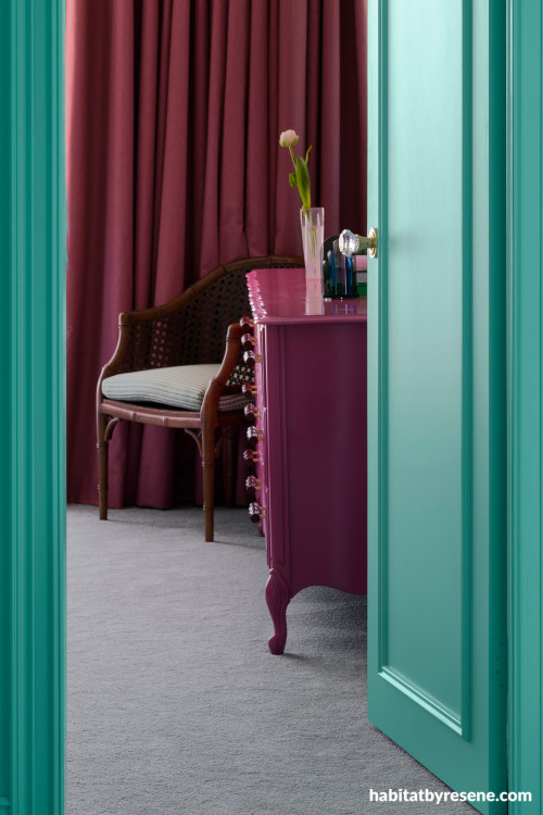
Bedroom furniture painted in Resene Enamacryl gloss in Resene Cardinal, doors and trims in Resene Lustacryl semi-gloss in Aqua.


Walls in Resene SpaceCote Low Sheen Aqua, cupboard doors in Resene Enamacryl gloss in Awash.

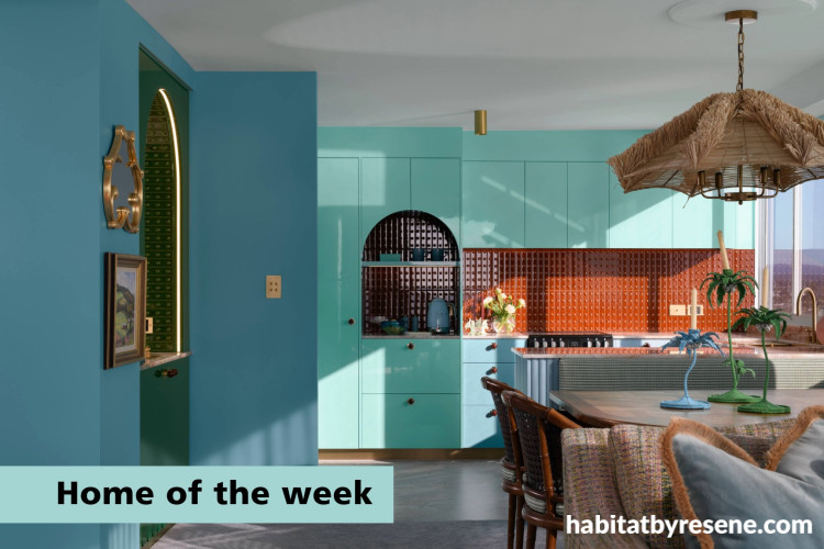
Palm Springs energy in Surfers Paradise
This home, set within one of Surfers Paradise’s iconic buildings, begins with a slice of history, gently carried forward and reimagined. “The apartment belongs to a Melbourne-based client whose father originally purchased it in the 1960s,” says Marina Hirst, Principal Interior Designer at Marina Hirst Interiors. “After inheriting the property, she decided it was time to breathe new life into the space.”
“The renovation was driven by the client’s desire to create a joyful coastal retreat, a ‘happy space’ she could escape to from Melbourne. Another important motivation behind the project is that the client has macular degeneration. Knowing that her vision may deteriorate over time, she felt strongly about creating a space she could truly experience and enjoy now, somewhere that reflects her passionate spirit and celebrates colour, texture and individuality.”
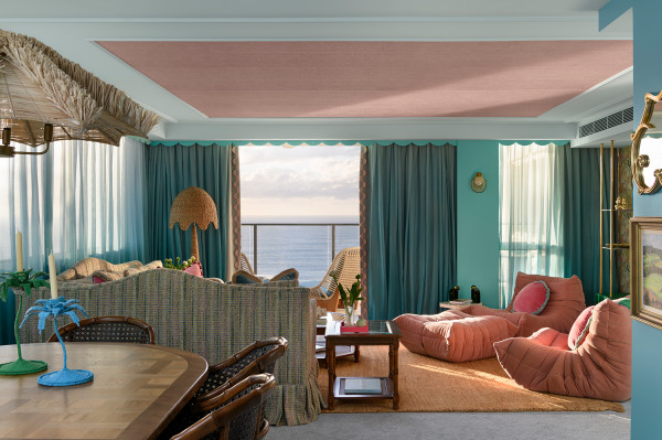
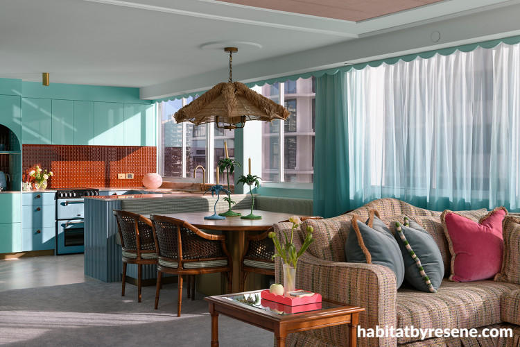
Living room walls in Resene SpaceCote Low Sheen in Aqua and right wall in Awash.
Marina’s brief from the client was wonderfully expressive. “‘Hollywood Regency meets Palm Springs and Miami Beach.’ She envisioned a glamorous space that encourages ‘holiday’ and that celebrated colour, personality and a sense of fun.
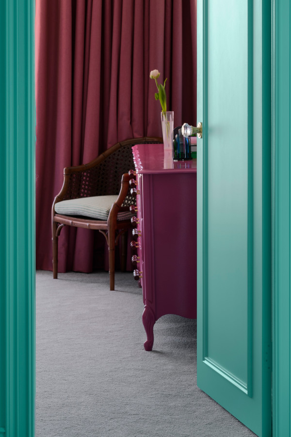
“Aqua, her favourite colour, was essential and needed to feature prominently throughout the apartment.” It runs through the home as a constant, wrapping walls and internal doors, carried up onto ceilings in a softer wash of a custom sixteenth strength Resene Aqua, and echoed in joinery and detailing, creating a thread that ties everything together.
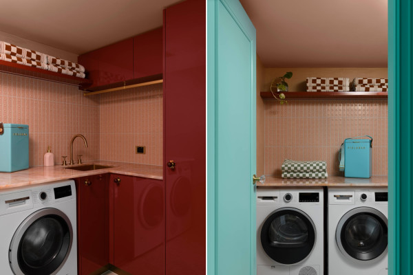
The laundry cabinetry is painted in Resene Enamacryl gloss in Fahrenheit, ceiling in Just Right and door in Aqua.
“The colour palette was developed from the ground up, beginning with the entrance floor tiles,” Marina says. With aqua, pink and forest green already in play – Resene Aqua, Awash, Just Right and Green Pea – something deeper was needed. “Burgundy became that anchor, which is why Resene Fahrenheit was selected. It provided richness and balance against the brighter hues.” And in the laundry, Fahrenheit in a high gloss adds a saturated depth, turning a practical space into something expressive.
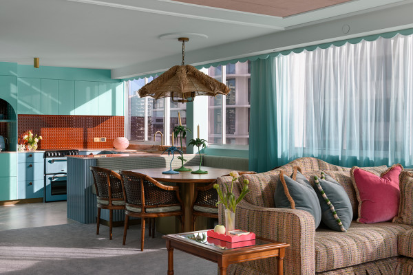
Kitchen cabinetry and dining space feature Resene Aqua and Awash.
Resene Awash moves more quietly through the apartment, used across lower cabinetry, the dining bench seat and storage and walls creating continuity between spaces. “To create cohesion throughout the apartment, the details were carefully considered,” Marina says. “Handles were specified in either burgundy or pink so that these accents would visually connect spaces and continually reference one another.
“This consistent ‘referencing’ allowed the design to feel intentional and cohesive, even with such bold colour choices. The goal was always to celebrate colour and texture while still creating a sense of balance and flow from room to room.”
Ensuite cabinetry in Resene Enamacryl gloss in Just Right and cupboards on right in Awash.
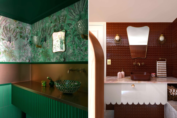
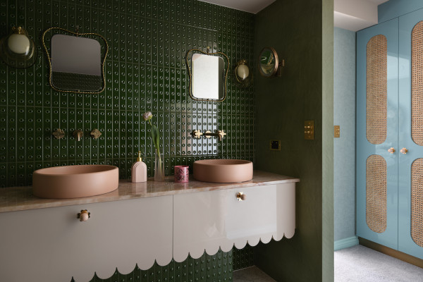
Left: Bathroom ceiling and vanity in Resene Green Pea, pairing beautifully with the green patterned tiles and bronze. Right: Vanity doors and ceiling in Just Right.
Resene Green Pea brings a bolder note, defining the powder room and bar, while Just Right softens the bathrooms, wrapping walls, ceilings and doors in a calm, enveloping tone.
“It became clear just how much the client embraced quirkiness, boldness and individuality. She was fearless in her approach, and that encouraged me to be equally confident and decisive with the design direction. Texture is always a strong feature in my work, so layering materials became an important part of the scheme.” Wall designs, bamboo inserts, brass mesh and rose stone quartz are layered throughout, bringing warmth and tactility to the palette.
“The bespoke, handcrafted dining table made by the builder reflects elements seen elsewhere in the apartment, the brass mesh of the bar unit, the geometry of the entrance tiles, and a subtle nod to the glamour of Hollywood Regency.”
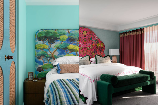
Bedroom furniture painted in Resene Enamacryl gloss in Resene Cardinal, doors and trims in Resene Lustacryl semi-gloss in Aqua.
The bedrooms each carry their own mood. In the master, aqua walls meet hot pink tones and deep green upholstery, with existing furniture refinished in Resene Cardinal.
The two other bedrooms vary in their designs. One was designed to feel softer and more subdued, while another explored a different mood entirely, with a playful juxtaposition of ‘beach to forest.’
Walls in Resene SpaceCote Low Sheen Aqua, cupboard doors in Resene Enamacryl gloss in Awash.
“It’s honestly very difficult to choose a favourite room but I’m probably most proud of the bathrooms,” Marina says. “They are quite different from the norm and really helped establish the foundation of the overall design aesthetic.
“In many ways though, the greatest challenge in this project, and also one of the most rewarding aspects, was the enormous level of trust the client placed in both myself and the builder.” Living in Melbourne, the client allowed the process to unfold from afar. “Luke, the builder, would occasionally send her small ‘snippet’ photos during the process, keeping a sense of surprise and anticipation alive as the apartment evolved.
“It was such a fun and unusual way to approach a renovation, and I truly believe that level of trust and creative freedom played a huge role in the success of the project.”
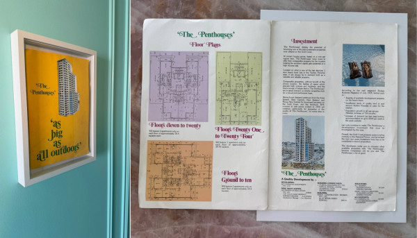
The original marketing poster for the iconic Surfers Paradise building has been framed and put on the wall in the apartment to pay homage to its history.
In the end, the apartment is defined by colour, not just as decoration but as experience. Each decision builds on the next, creating a home that feels cohesive, expressive and full of life. “My unicorn client,” Marina says. “Joyous! Best brief, best builder, best budget, best outcome.”
design Marina Hirst, Marina Hirst Interiors
build Luke Tomkins, Tomkins Constructions
paint Brent Goodair, Colonial Colours GD
cabinetry Kyle Alexander, Kyson Cabinetry
images Mindi Cooke, Mindi Cooke Photography
Top tip: If you’re loving this glossy look like on these cabinets and furniture, Resene Enamacryl gloss is your go to option. It is waterborne and Environmental Choice approved with the durability of a traditional solvent-borne enamel. It provides a tough, high-gloss finish that resists the daily wear, tear and staining typical in kitchens, bathrooms and high-traffic areas. It also really makes bolder colours pop!
Published: 12 Mar 2026
Do you have a home full of wonderful Resene paint and colour? Send us some snaps by emailing editor@habitatbyresene.co.nz.


the look
If you're stuck on what
colour to use or need colour
advice, try out the Resene
Ask a Colour Expert service.
the look
If you're stuck on what
colour to use or need colour
advice, try out the Resene
Ask a Colour Expert service.

