Dave and Anna's Bright Bungalow
Published: 07 Apr 2011
Do you have a home full of wonderful Resene paint and colour? Send us some snaps by emailing editor@habitatbyresene.co.nz.
Letting the light in
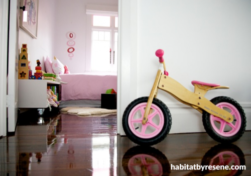
Like many 1920s bungalows, Dave and Anna's home suffered from a serious case of light deficiency. When they first moved in, eight years ago, "It was dark, dreary and cold," recalls Anna. "Much of the house was in its original state. The kitchen and bathroom were very basic, and you had to go via the back porch to get to the toilet." The enclosed back porch not only restricted light entering the house, but prevented any sense of indoor-outdoor flow.
Anna, who has her own interior design company, Anna Welsh Design Ltd, saw past the outdated features and lack of light, to the "fantastic proportions" of the house, its wide central hallway, high ceilings and large back lawn nestled among native trees. Soon after moving in, she got rid of the enclosed back porch and added a modern extension to the back of the house - no mean feat, since it involved excavating into Mt Eden's notoriously unpredictable volcanic rock. A modern bathroom and kitchen replaced the outdated ones, and the entire interior of the home was painted with Resene Black White, a soft shade of white. What was once dark and dreary is now brilliantly light and bright.
"I like Resene Black White for its simplicity and the beautiful play of light you get with it," explains Anna. "I find that using the same light colour on walls and ceilings gives a simple, clean aesthetic." It also provides a dramatic contrast to the dark wood of the floorboards and kitchen cabinetry, and the colourful textiles used in the children's bedrooms.
What did you want to achieve with the rebuild and renovation? I wanted to create a warm, spacious home with good spatial flow and abundant light. Interior-exterior flow was very important. The back of the house originally sat very high off the level of the garden so I wanted to create different levels in the house and decks, to get a better connection to the outdoor area.
What was the greatest success? The extension to the back of the house, with its soaring roofline and skylights. It has a fantastic feel to it. The connection between interior and exterior has been very successful. My children love it!
Which space do you get your greatest satisfaction from, and why? The kitchen and family area. I designed the kitchen to my specification and got exactly what I needed. It works perfectly for the family and seamlessly integrates cooking, eating and socialising.
pictures Interior architect and designer: Anna Welsh http://www.annawelshdesign.co.nz/ Architectural designer: Fraser Gillies of Lines Design Ltd Photography: Toby Sharpe and Jeff Brass
Lighten up
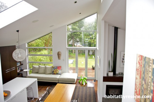
The extension to the back of the house features large skylights and plenty of windows to maximise light.
Cooked to order
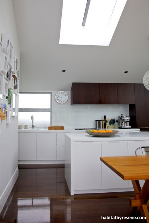
Anna's favourite room in the house is the kitchen, which she designed herself.
Laugh and be merry
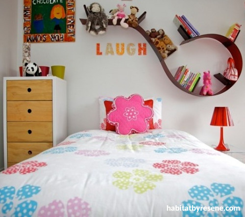
Brightly coloured textiles and a curving shelf give this room plenty of personality.
pictures Shelf by Bookworm from Kartell
Deck the halls
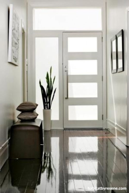
A glass frontdoor lets in some much-needed light to the wide hallway.
the look
If you're stuck on what
colour to use or need colour
advice, try out the Resene
Ask a Colour Expert service.
the look
If you're stuck on what
colour to use or need colour
advice, try out the Resene
Ask a Colour Expert service.


 look book


