
latest
habitat tv

Say goodbye to the morning scramble for keys, coats and sunglasses and hello to this… see this and more videos
blog

The artistic world of ArtFull Studio
Ladan's artistry is a beautiful blend of personal expression, texture and timeless materials. With over… more
Nat Davis marks a new chapter in New Zealand’s interior design story
11 Feb 2025
With a passion for design and an extraordinary multifaceted career, Nat Davis has long been immersed in the world of architecture and interiors. Now, as the founder of The FOLIO Design Report, she’s bringing a fresh perspective to the industry – one that places product selection and craftsmanship at the heart of the conversation. We speak to Nat about The FOLIO, her journey in design publishing, and what’s next for this exciting new platform:
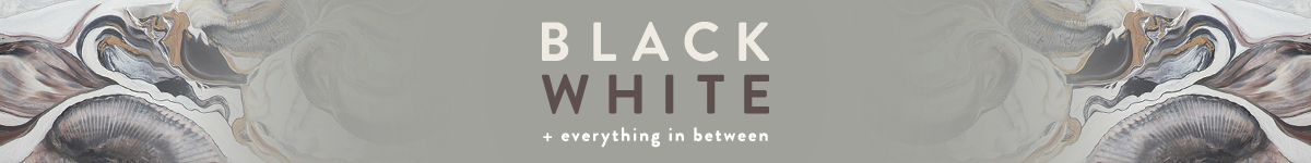
Can you tell us a bit about who you are?
“I’m Nat Davis, founder of The FOLIO Design Report – a new publication dedicated to New Zealand’s premium interior design industry. My background is in media, publishing and brand partnerships and I’ve spent the past 20-plus years immersed in the world of architecture and design. I’m passionate about bringing people together – whether it’s designers, product suppliers or craftspeople – to share knowledge and celebrate the incredible work that defines our built environments.”
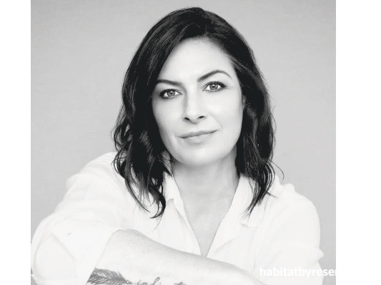
Volume One of The FOLIO Design Report by Nat Davis.
Congratulations on the launch of your new publication, The FOLIO Design Report! Can you tell us about this and what inspired you to start it?
“Thank you! The FOLIO has been a long time in the making. For quite some time I have felt that there was a gap in the media space for a publication that puts product selection at the heart of the conversation – because, ultimately, every designer’s vision comes to life through the details: the carefully selected furniture and finishes, the textiles, the lighting, the colour palettes.
“It’s a bi-annual design report showcasing premium interior brands and the designers who work with them, with an emphasis on high-end interiors and the materials that shape them. It’s a high-quality print publication produced especially for the interior design trade and their high-end clients. FOLIO is about connecting designers with these products in a meaningful way while also providing a platform for brands to share their expertise, processes and innovations. Designers can request a copy through thefoliodesignreport.nz or collect one from one of our partnering brand showrooms such as Studio Italia, Dawson & Co., Simon James, Ligne Roset, Bauhaus and more.”
What has been your favourite part of bringing FOLIO to life?
“The response from the industry. Seeing designers, brands and suppliers immediately understand what FOLIO is about and want to be part of it has been incredible. There’s a real appetite for a platform that champions the details – where the stories behind materials, craftsmanship and innovation are front and centre. Also, the creative process – curating the content in partnership with these amazing brands, refining the aesthetic and shaping FOLIO into something that feels fresh yet timeless – has been hugely rewarding.”
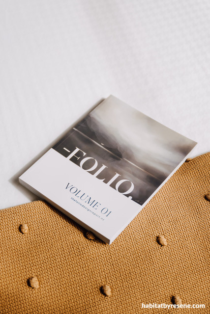
Nat presenting at the launch of The FOLIO in Auckland.
What has your career path been like to get you to where you are today?
“My career has always been in the space where media and design intersect. I spent many years at HOME magazine, working across commercial and design roles, which gave me invaluable insight into the industry and the people who drive it. I’ve also been on three television shows, the most recognised being Mitre 10 Dream Home where I was the design judge for five years. That experience, combined with my background in brand partnerships, led me to launch FOLIO – a project that brings together everything I love about design publishing, but with a new focus on the products and brands that make exceptional interiors possible.”
What interests you about architecture and design?
“The way it shapes how we live and feel. Good design isn’t just about aesthetics – it’s about experience. How a space functions, the materials that surround you, the way light moves through a room – these details impact us daily, often in ways we don’t even realise. I love that design is both an art and a science – creative yet technical, aspirational yet deeply personal.”
Do you have a favourite project you have seen or worked on over your career?
“There have been so many over the years! Literally hundreds. One that stands out is CoolHouse by Jessop Architects – it’s a masterclass in materiality, with a refined yet relaxed sensibility that just works. The series of architectural designs in the CoolHouse range allows for variations of site configurations and interior options for clients to bring their own personality to the space, making it truly unique in their own way. The same plan will look completely different depending on the materials used. And, of course, the use of colour is considered and confident, which makes all the difference. In the Snells Beach CoolHouse featured in Volume One of The FOLIO Design Report, the homeowner has used Resene Milk White throughout – it’s the perfect colour to offset the architecture of this stunning home.
“Resene’s finishes have been part of so many iconic projects, and I love seeing how designers push the boundaries with colour – whether it’s a bold statement or a beautifully nuanced neutral.”
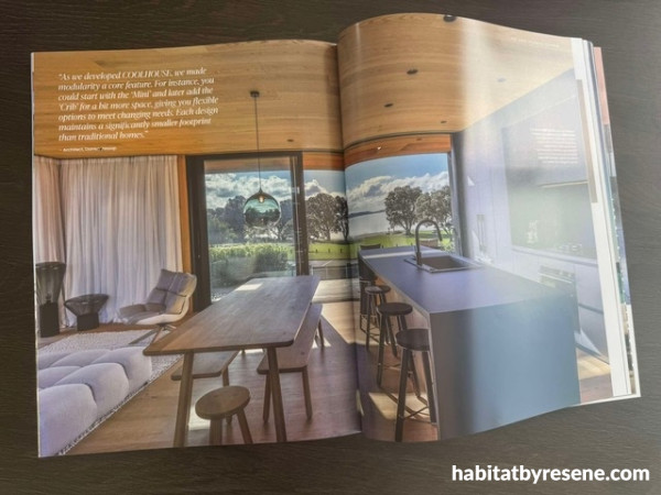
CoolHouse, featured in Volume One of The FOLIO Design Report.
What is next for you? And what do you hope to see for FOLIO in the future?
“We’re just getting started! FOLIO will continue to evolve, with plans to expand our digital content and introduce more interactive elements. I see it growing into a dynamic resource – not just a publication, but a platform where designers and brands connect in real time through events, collaborations and exclusive content. To reach designers nationwide, we’re planning launch events in Queenstown, Wellington and Christchurch. There’s also the exciting prospect of a FOLIO TV series on SKY TV – something that may come to life down the track. The possibilities are endless. Watch this space!”
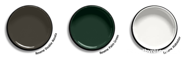
What is your favourite Resene colour/s?
“I have a soft spot for deep, moody tones that reflect natural elements like our rugged coastlines in New Zealand, such as Resene Double Masala - a brooding grey, the calm before the storm. But I also love mossy, deep greens like Resene Palm Green – that kind of effortless, sophisticated hue that pairs with almost anything and makes you feel like you’re in nature. And you can never go wrong with a crisp, fresh white – Resene Alabaster is a classic for a reason.”
Published: 11 Feb 2025
more inspiration

Product of the month: Resene plant-based paints
It’s great to see the demand for sustainable and eco-friendly… more

Meet the team: Phillip Willemse
What is your role at Resene and what does it… more

The mood of May: Why this deep, vivid hue is the colour of the month
Color Marketing Group (CMG) have announced the latest hue that… more

Design Experience 2025: Unlocking opportunities in architecture and urbanism
Design Experience showcases some of the leading names in architecture… more

Award-winning holiday home documentary opens Resene Architecture & Design Film Festival
After four years of filming, the journey of the Chodge,… more


 look book